
Initial Briefing:
We met with the client to check initial guidance and they didn’t have much experience with framing their brand in a confident and refreshing way. They left it to us to create a few different concepts of how to showcase their brand with the intent to make them the proxy investment for the silver market.
Below you can see an initial three concepts for how to showcase their brand and product. Their bar has an iconic sigil on the front, making for a great focal point. Ultimately they decided to proceed with option 1 but using the bright colors of option 2.
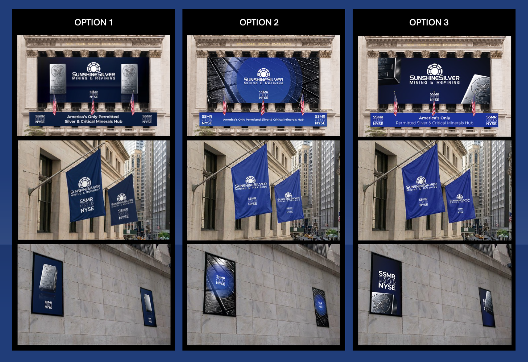
Various concepts for initial design consideration.
A Big List of Deliverables:
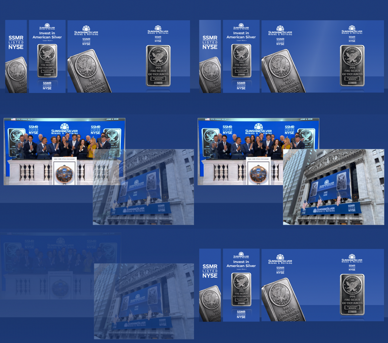
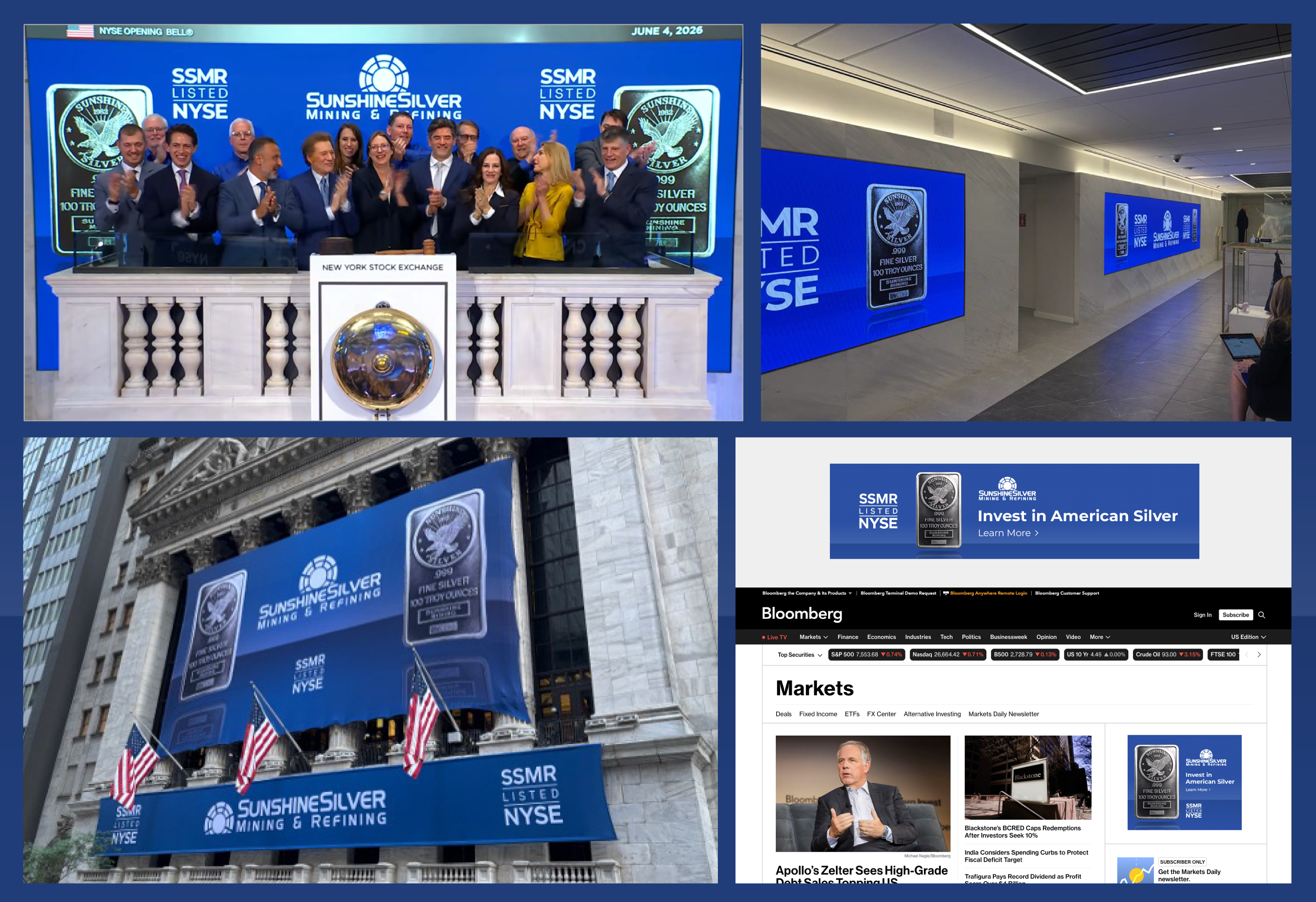
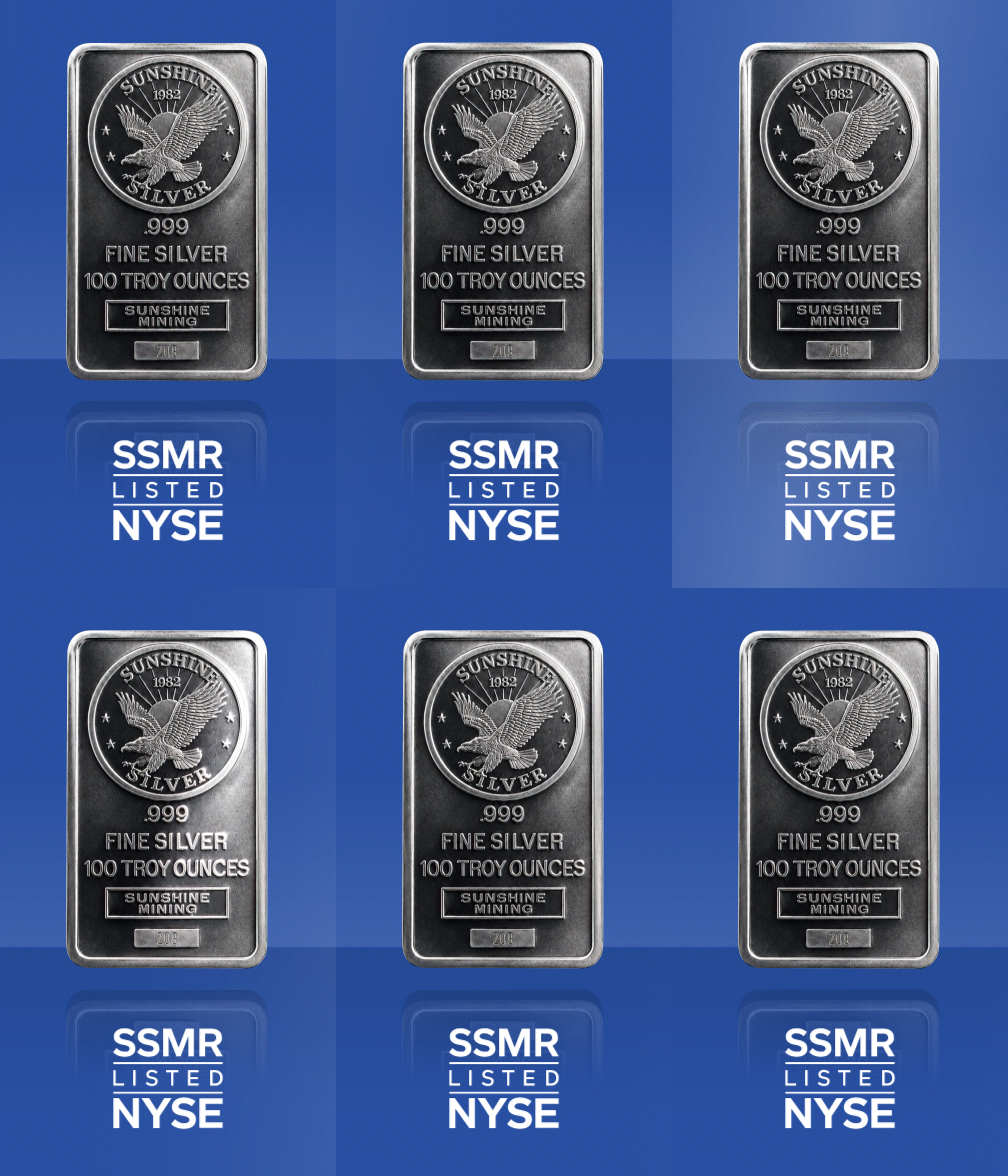
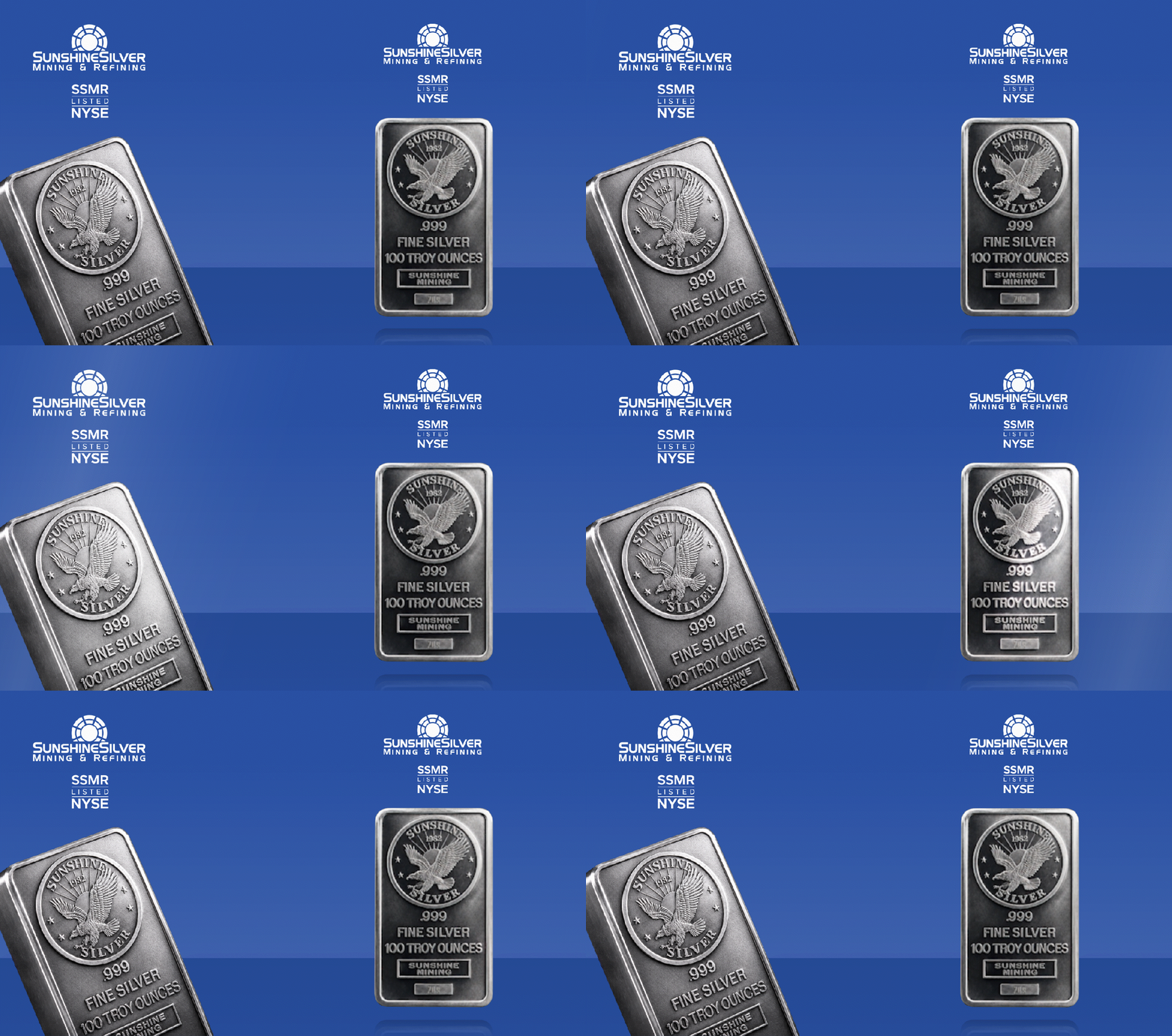
The huge list of different deliverables within a tight deadline was the biggest hurdle. Our team laid out high-priority assets and worked through the big ticket print items first before moving onto the digital screens. The asset shifted from having a angled view on the silver bar to showing it fully facing forward with a subtle reflection. Throughout all the assets, the silver bar is shown elegantly floating with luxurious lighting to emphasize the sheen of the metal.
Pacing the Event with Animation:
There were many opportunities to use subtle animation across the digital screens. We stayed with a subtle and luxurious style by only animating a lighting sheen that passes over the bar plus an elegant floating animation on the front-facing bar. This helped add novelty to the assets on the day since there were so many similar looking assets.
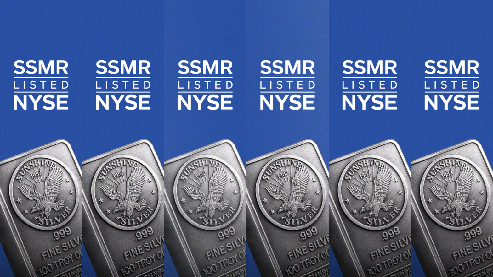
Animation also was used on the New York City’s Times Square screen which required us to work with the curved screen in mind. While we initially thought a spinning silver bar in 3D would work well for this asset, the reality of the timeline meant we had to pivot into a mix of showing the bar in the front-facing and slanted ways seen in the other assets.
More projects