
Keeping the Campaign Fresh:
Below you can see the previous 2024 design, originally designed by me as well, that had a boxier feel that accomodated pull quotes but with heavy white borders. Initial guidance for 2025 was to take this design and make it more refined and add dynamic shape language that could help spotlight partners.
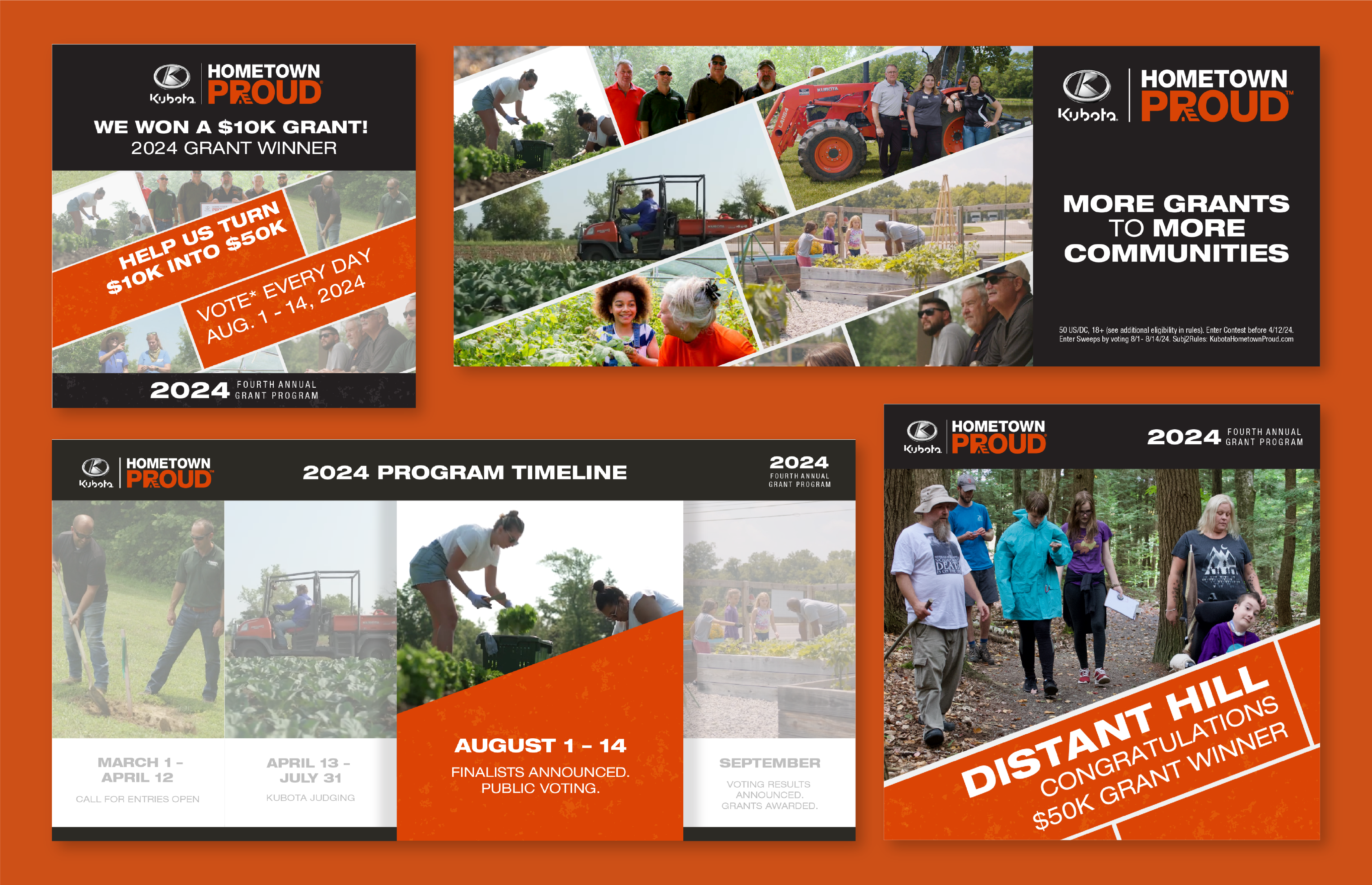
2024’s design direction.
Creating the Concepts:
The initial conception explored three options focusing on bringing through the ‘brick’ grid layout from the previous year while also creating a new style to evoke a feeling of either the ‘fifth annual’ message or the scrappy nature of the applicants taking part in the program.
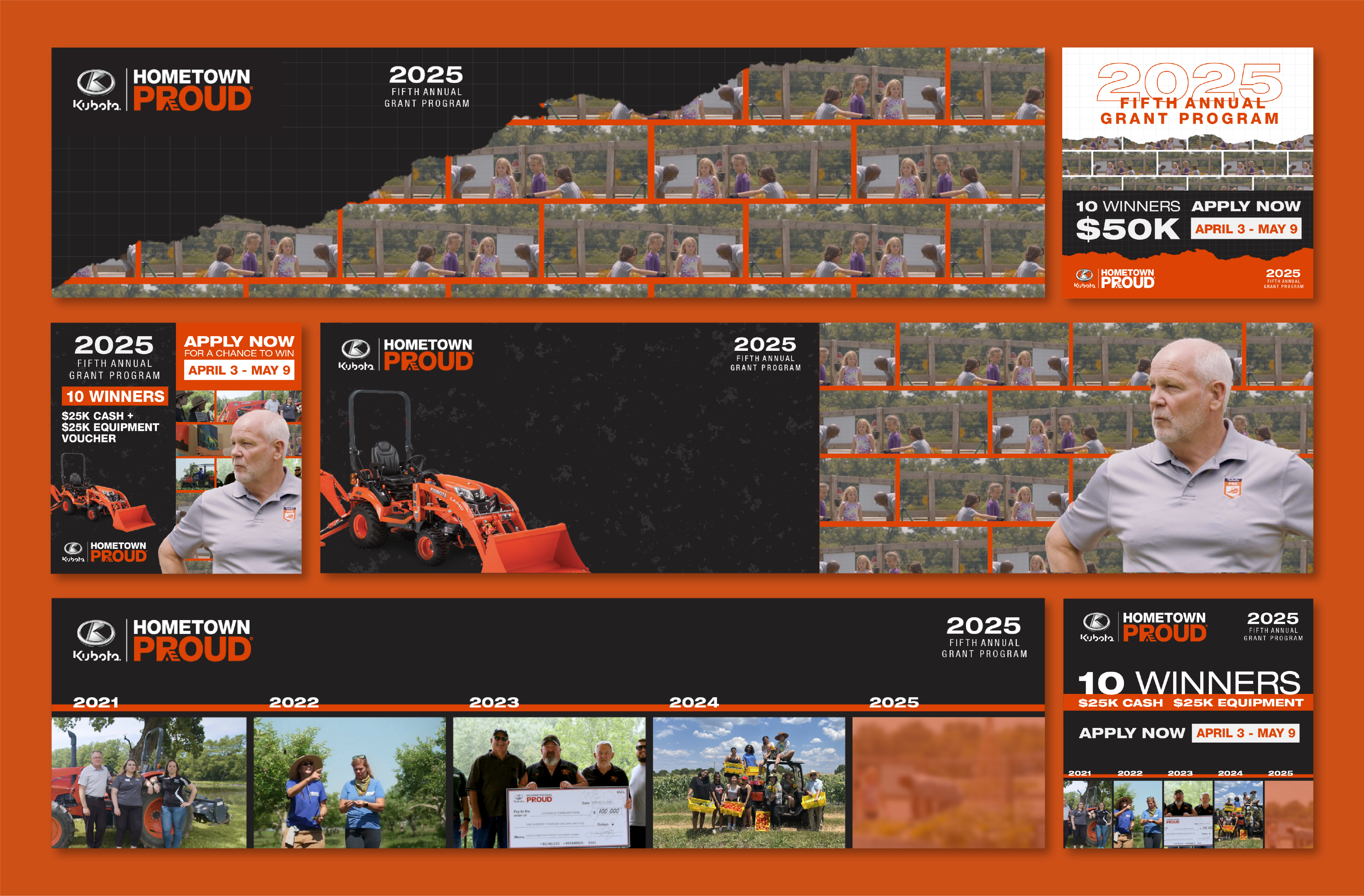
Concepting for three different styles.
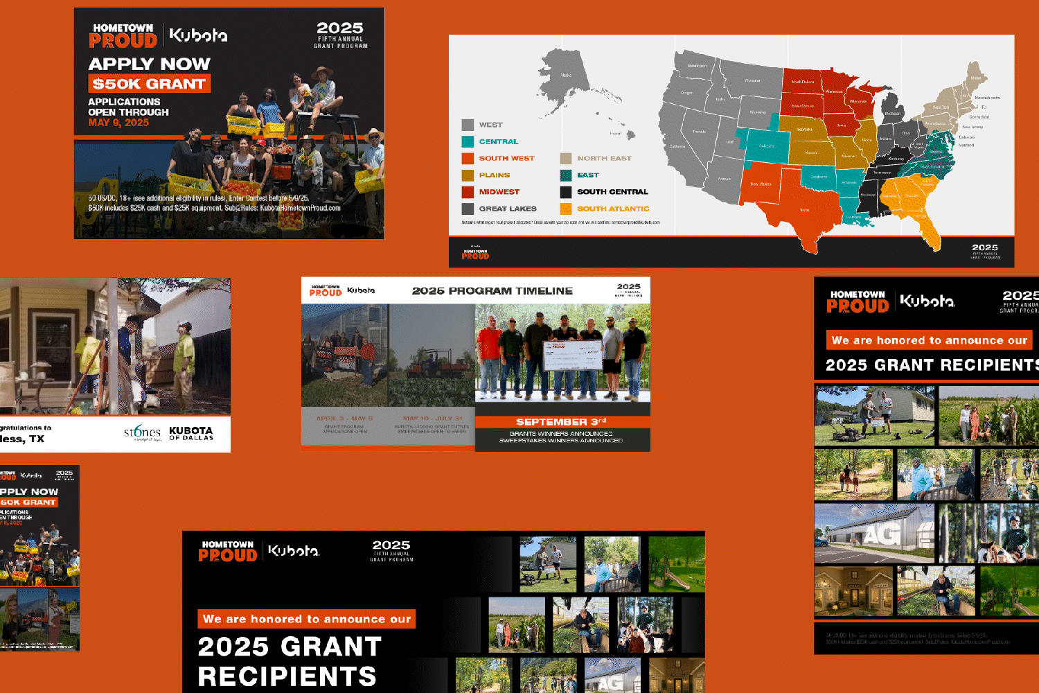
Creating Each Phase:
The client chose to combine the middle and bottom styles, the line and breakout imagery felt compelling and felt like it stood out and didn’t veer too far from the main brand guidelines. After that, we began to craft assets for both social, microsites and print. Below you can see the progression of assets for all three phases of the grant program across the year.
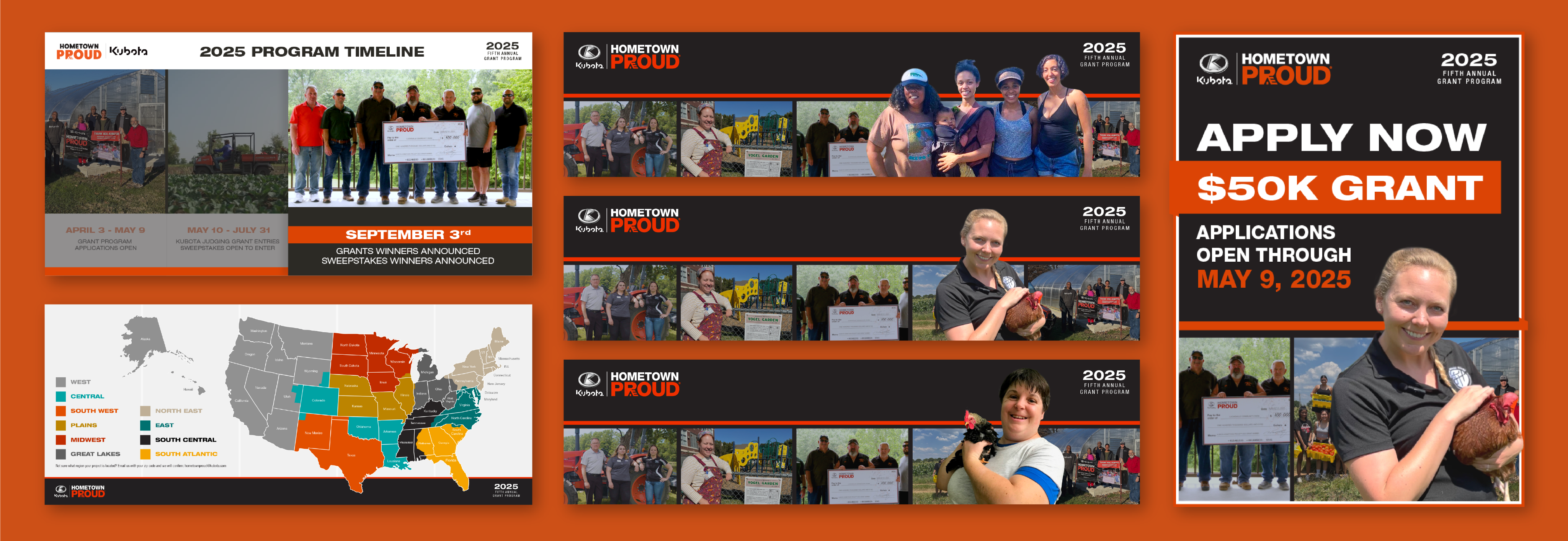
Launch phase assets used on both a microsite and social feeds.
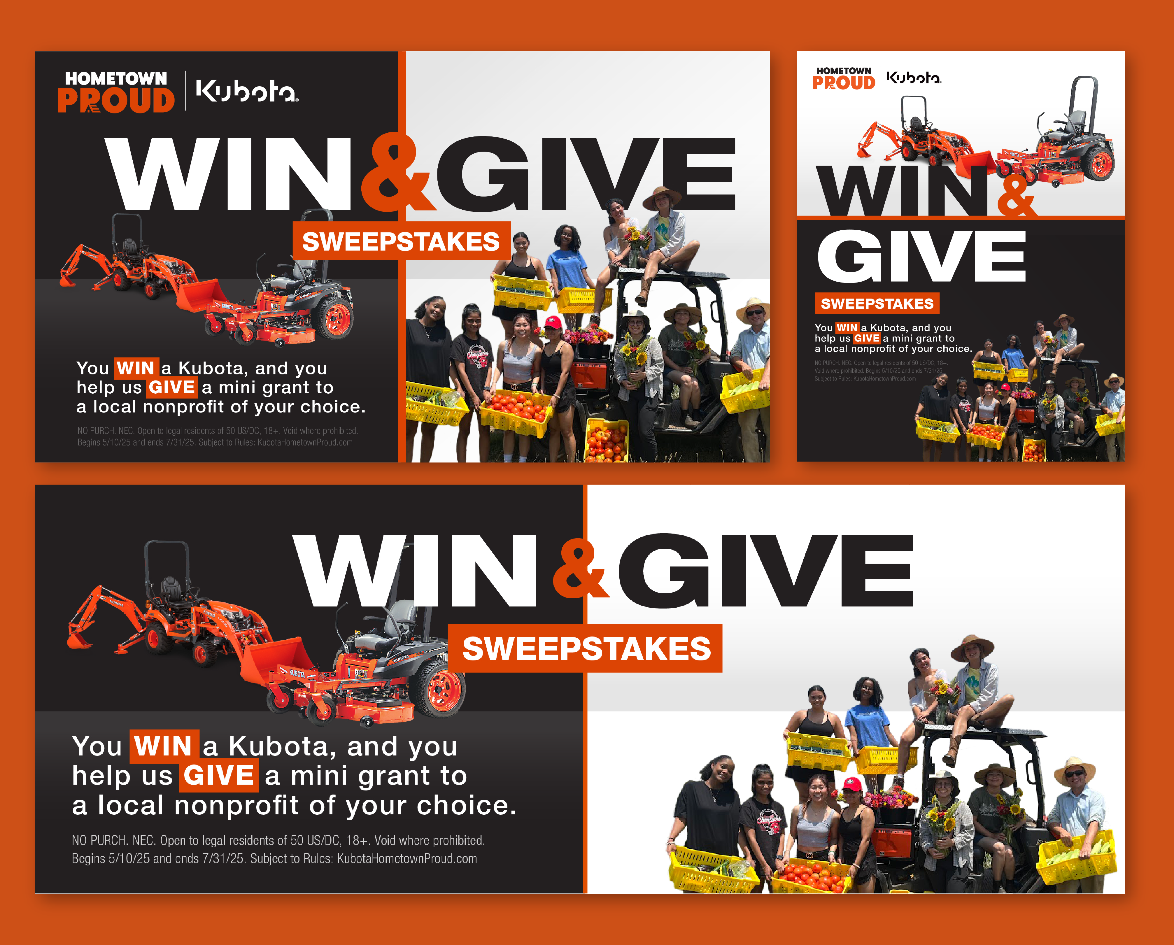
Sweepstakes imagery to advertise getting involved in the program as an individual.
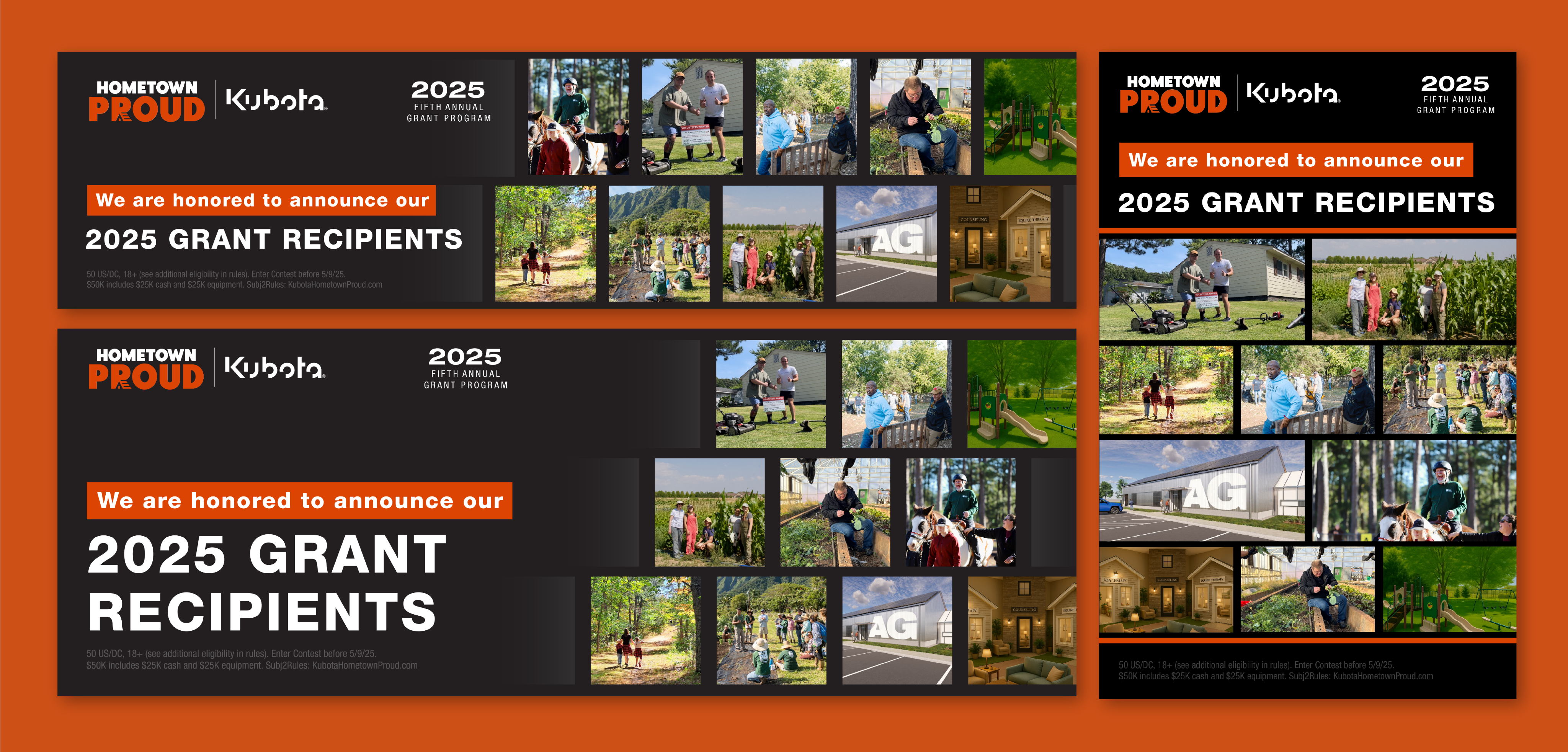
Winner phase assets, static and animated, that showcase the winner of the grants.
While I was the main designer, I had art direction oversight from my coworker who also excels in brand design. We made initial layout concepts and decided that full-bleed imagery plus ‘break-out’ masking felt most compelling.
Winner and Summary Video:
Asset production culminated in the creation of a recap and winner video, in two formats to post on social and display without audio at an event. This was a more involved process of using AfterEffects to ensure each winning project got a small shout out and the yearly campaign could wrap up and point to next year’s program.
The final version of the full sizzle reel.
You can see the alternate landscape version that was displayed at a dealer-focused event here.
VO was removed for this silent wide format version of the video displayed at an event.
More projects