
Moodboards:
There were some images given and keywords, such as casual, adventure, fun and I spent initial time making a mood board to initiate design exploration.
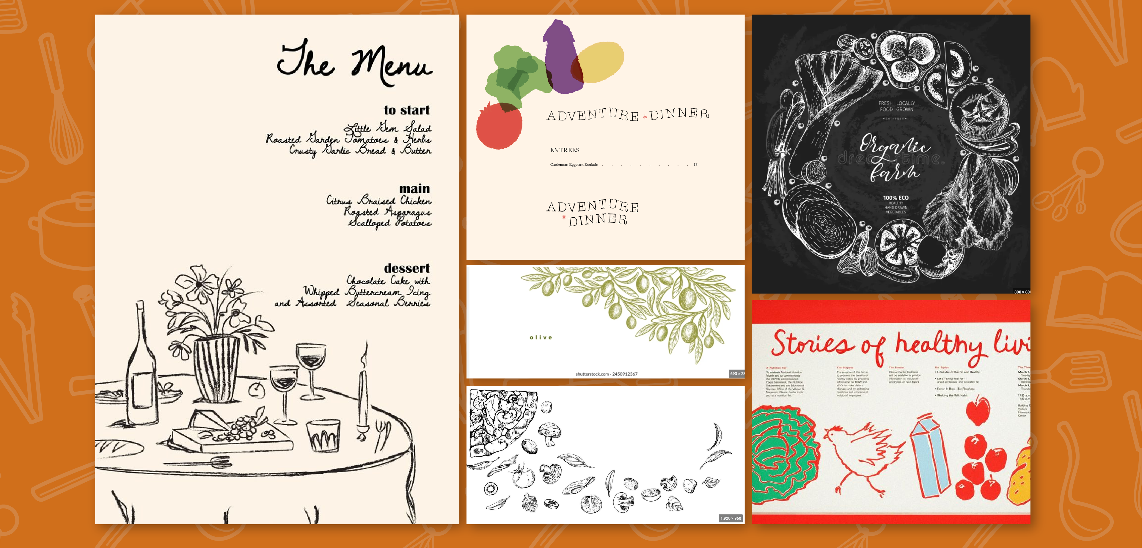
Initial mood board based on client direction.
I pulled a variety of hand drawn brands and executions that matched the communicated intent of the brand and started to test different ways to make bespoke versions of illustrated fruits and veggies for their brand update.
Three Playful Options:
Three styles emerged on how to execute the illustration. One was felt more aligned with playful kid branding and the two others were a more elevated sketch style, one with full color and another white outlines only.
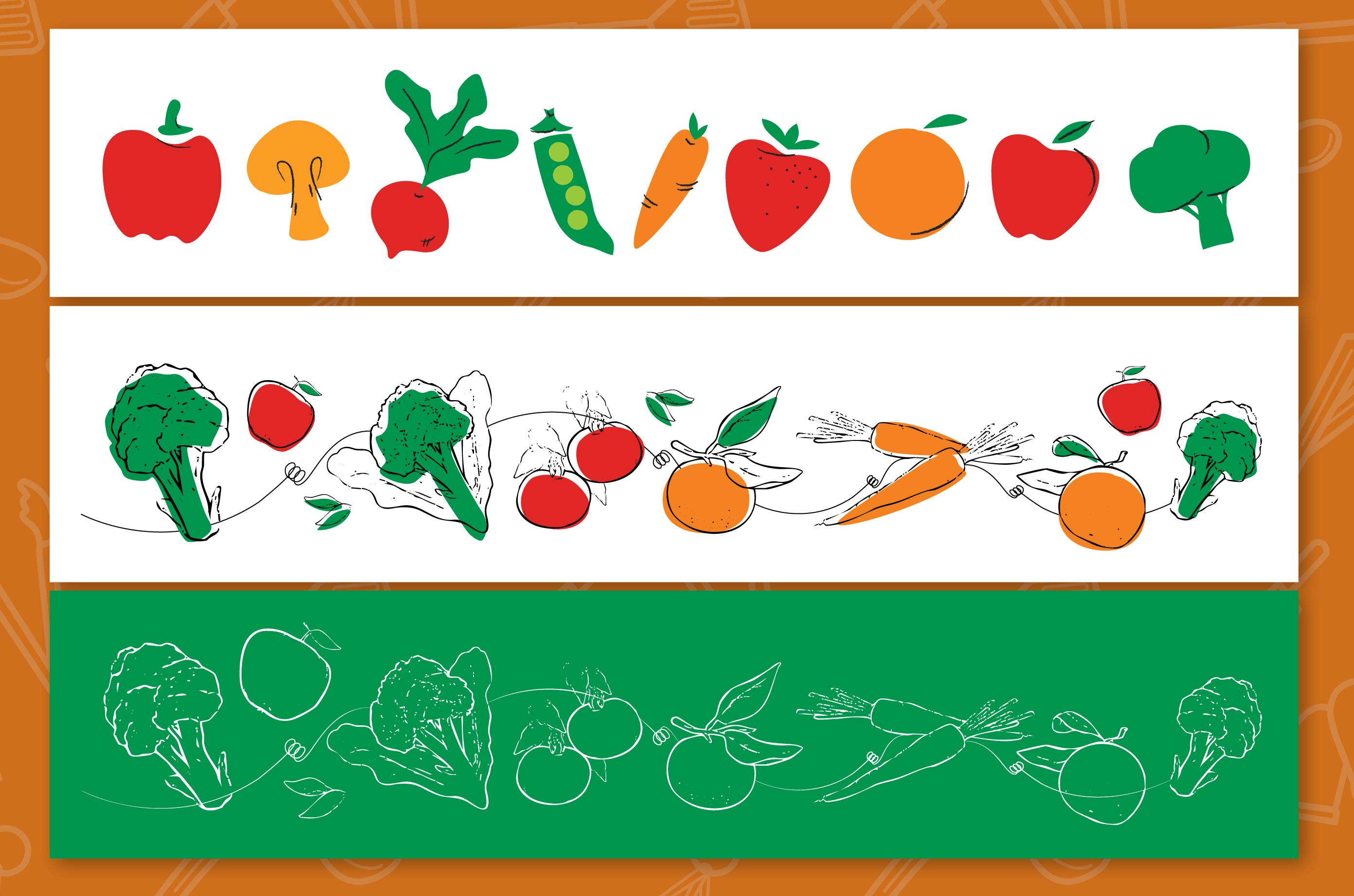
Three distinct styles of illustration were created as the backbone of the brand.
After discussions with the my art director, we decided the elevated, multi-color sketch feel served the purpose of the brand best. I drafted three lock ups to showcase possible style execution and then sent it to client for first review.
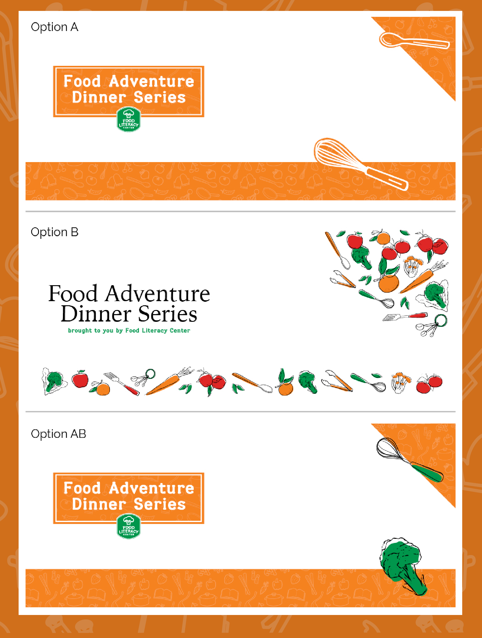
Three variations were giving to client, they selected the third, AB.
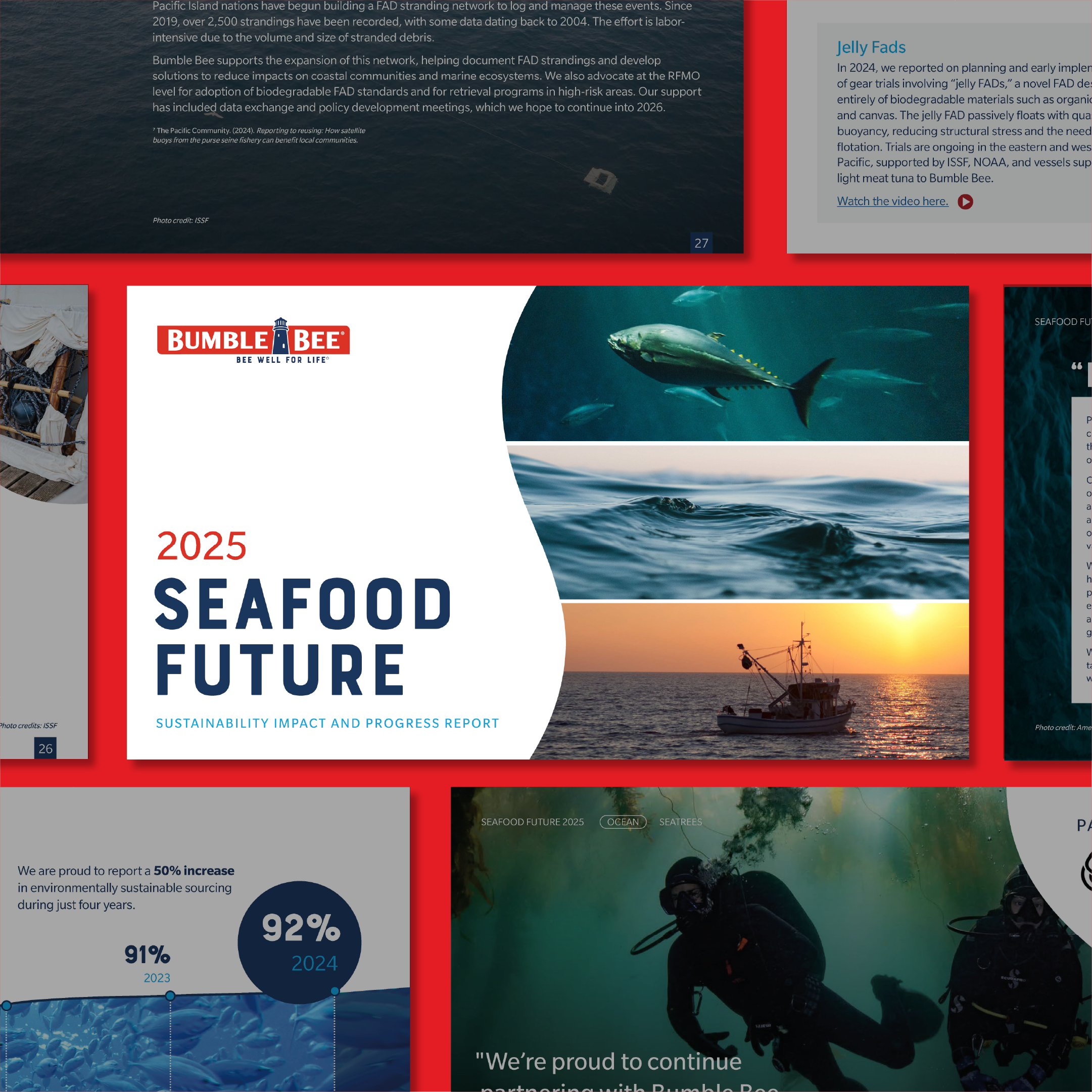
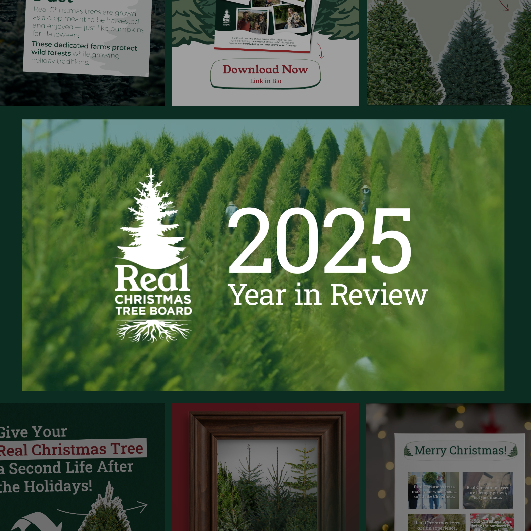
The selected a combination of Option B and Option AB which used the patterned background plus the range of illustrated food/kitchen items and requested we add additional food illustrations that depicted a wider range of cultures. Below is a display of all brand assets and how it was to be used on print and digital material.
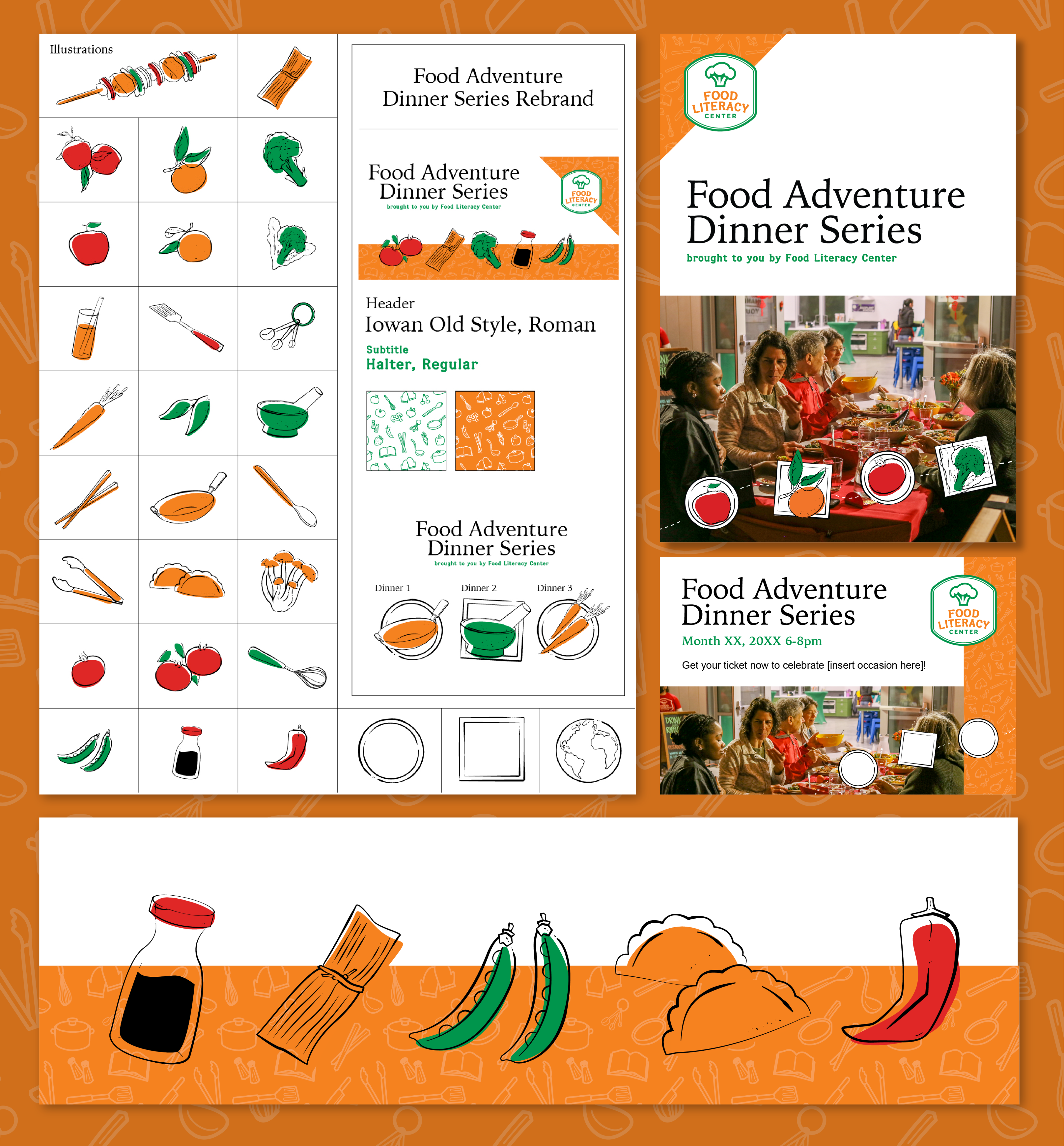
Finalized/approved assets that comprise their updated branding.
Additional Request, Canva Templates:
After designing and getting the social content approved, a request to summarize and highlight the year’s work came in. This required preliminary storyboarding and extensive Here are the initial versions of some of the social content.
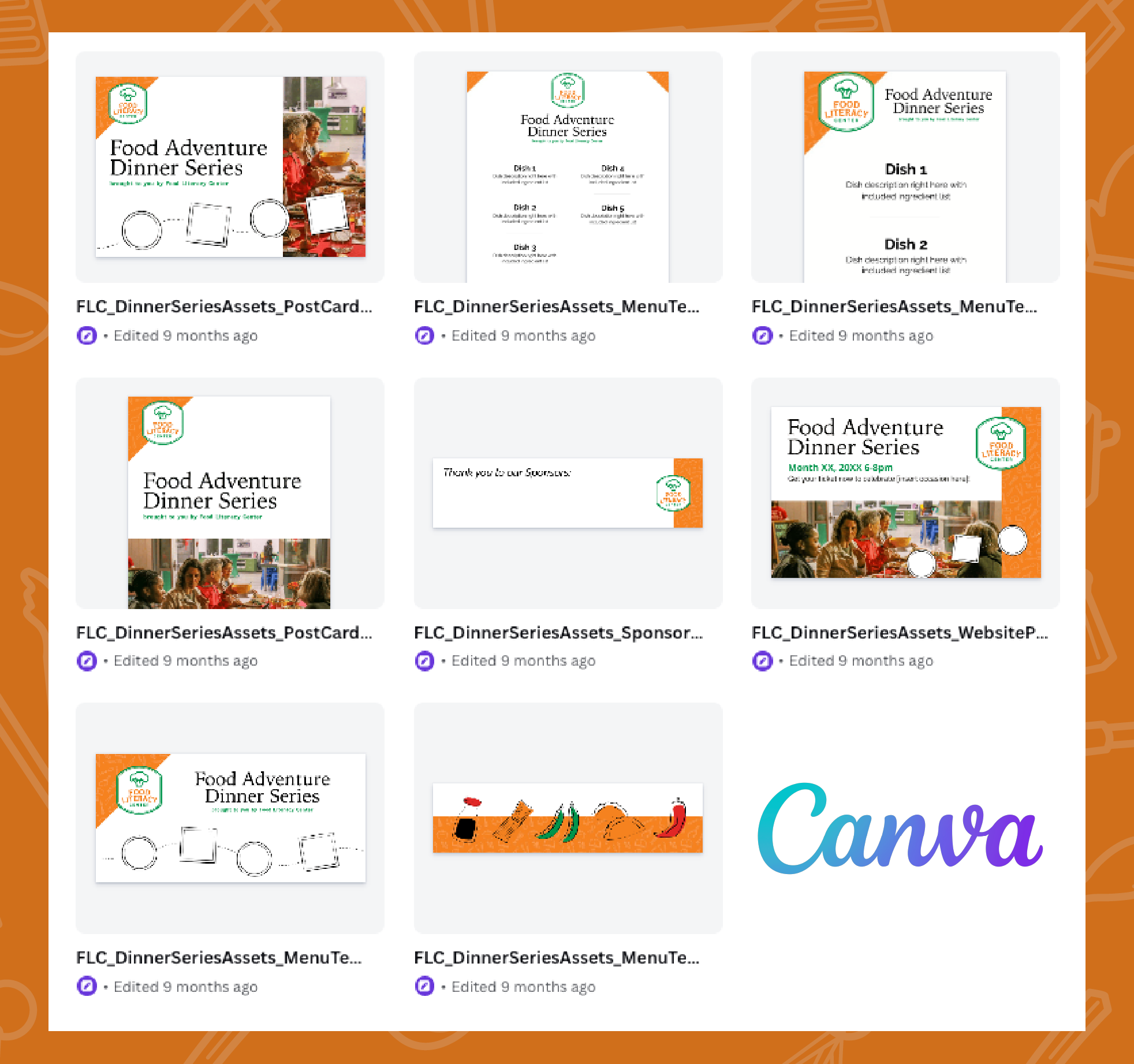
Canva templates created and provided to the client.
More projects